Now let’s fit a line to this graph. Under Chart choose Add Trendline. Click on the Option tab and check the box for display equation on chart and display R2 value on chart.
The R2 value is the square of the correlation coefficient. It is calculated based on the squared vertical straight line distance from the points to the line as illustrated below.
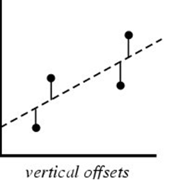
Without discussing the entire math procedures, the calculation produces a coefficient that is closer to one if the deviations are close to the line – just like in correlation – and gets closer to zero when there are large deviations. Sometimes there are sample points that are very different from the general trends. These are called outliers. By finding the outliers you can see which samples don’t meet the pattern and remove them from the analysis. This will improve your line. It also tells you the places where something different might be going on.
There are several ways to find the outliers. One way is to create a line graph of the same data and look for places where the trends are different. Let’s do that now. Choose the same columns but this time choose the line graph. When you get to Step 2 of the wizard, click on the Series tab to let you label the Category X Labels. Click on the right part of the box by that value as demonstrated and then go back to the data table and choose the HUCdate items to label your graph. Put in a title and axis labels at the next step and then save it as a new worksheet called IBIQHEIline.
Now examine this graph. Notice that the trend reverses at 3006084 until 3007084. Something different must be happening at this place that negates the benefits of a very good habitat. What could it be?
Let’s see what impact removing the outliers have on our regression model. Go back to the spreadsheet data and cut the values of IBI between 3006084 and 3007084 and paste them into the column to the left of the HUCdata. Now look back at our scatterplot. Notice that there is a dramatic improvement in the coefficient of the line.
| | |